The constraint was simple: if it failed on a patchy connection, it failed. It needed to handle the practical parts of the trip while still making each day feel like a game. That tension—useful first, magical second—shaped every release.
The product timeline
Twelve releases went out; these are the eight milestones that mattered, from the first native build to departure week.
Day one: a proper app, from scratch
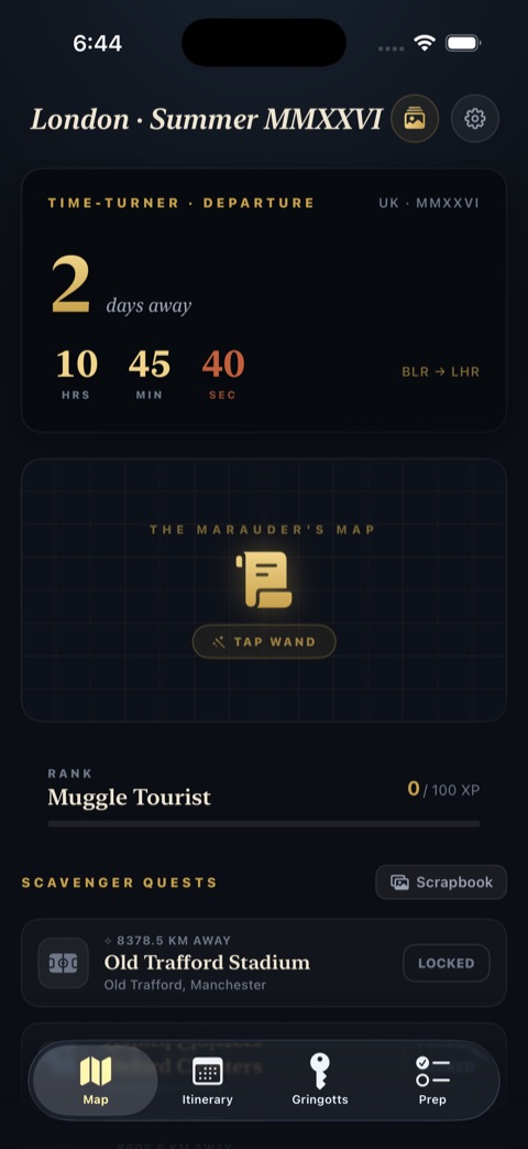
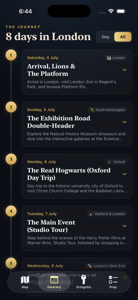
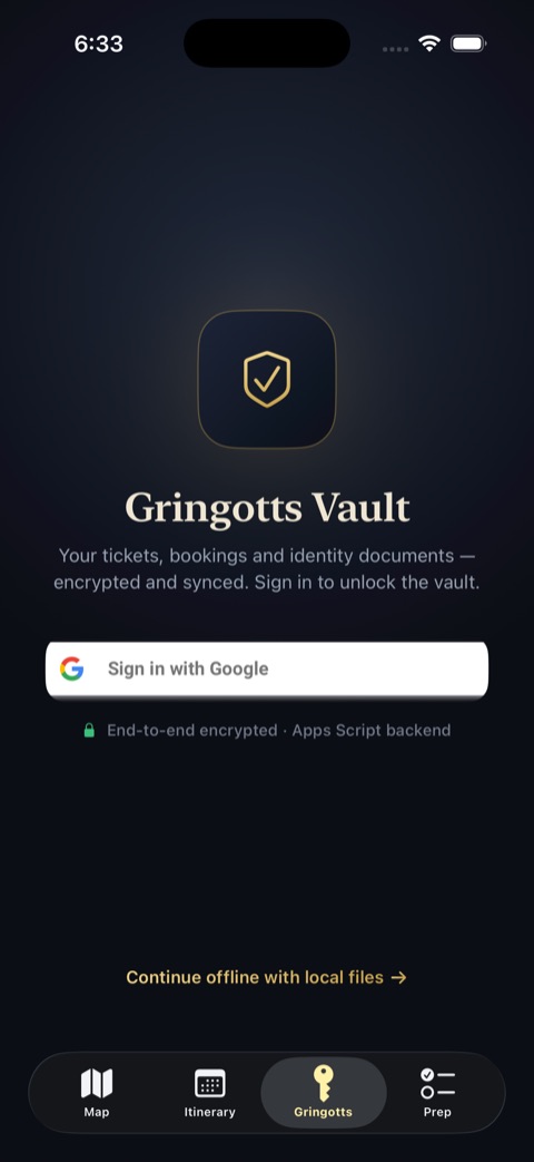
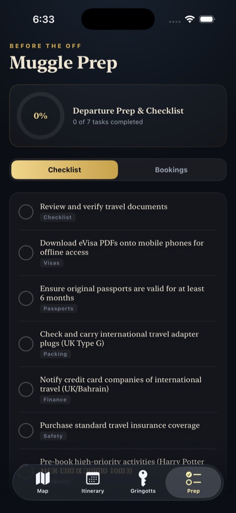
One companion that holds your whole trip — itinerary and bookings — and works with no signal. The first version felt like a website squeezed into an app, so I scrapped it and rebuilt it native, with four clear tabs: Map (live departure countdown and open quests), Itinerary (each day as a card), Gringotts (tickets and documents, synced and saved offline), and Prep (a checklist that remembers).
Secure sign-in, much faster loading
One-tap Google sign-in so private travel documents stay locked to you, and a leaner fetch that pulls just the essentials — a big speed-up on a patchy mobile connection.
Turning the trip into a game
A location-based scavenger hunt: get near a landmark and the app nudges you to snap a photo and unlock a scrapbook entry. Save a booking and it quietly ticks off the matching itinerary item. Earn enough points and you climb from “Muggle Tourist” to “Minister of Magic.”
A richer look — and fewer crashes
A big visual pass: warm gold gradients, frosted-glass panels, gentle spring animations. Also tracked down the launch crashes — a few missing setup details, now sorted.
A glanceable widget: the Daily Prophet
A Home Screen widget with your next flight and remaining to-dos, refreshed the moment your checklist or plans change.
A big tidy-up under the surface
All trip details moved into a single file so a plan change is quick and safe; the messiest screen broken into tidy pieces; the widget kept perfectly in sync; camera permissions plus a fake-location test mode so I could rehearse the scavenger quests before the trip.
The Nightfall redesign
Every screen redesigned from the ground up — from a functional themed UI into a cinematic dark experience. Deep obsidian layers with radial depth, one warm antiqued gold across every button and highlight, and an elegant serif paired with a clean modern face. Nothing carried over unchanged.
Rich rather than flashy — a world, not a screen.
Departure week: voice, maps, stability
The reveal now listens for the spoken spell — handled on-device, with playful comebacks when you fumble the words. Routes trace actual London streets with a glowing gold trail. And the frozen countdown and one stubborn crash were squashed, so it stays reliable on the day.
Where the theme earned its place
The theme stayed only where it made the trip easier to navigate or more memorable. These were the four ideas that earned their place.
What I’d do differently
- Start native immediately. The first web-shaped version introduced constraints that were eventually discarded.
- Test offline conditions earlier. Airplane mode, weak connections, cached documents, and route failures should have been part of the earliest builds.
- Separate trip data from the interface sooner. Last-minute itinerary changes exposed how tightly the first versions coupled content and presentation.
- Keep delight optional. Voice, animation, and location mechanics should add atmosphere without standing between the traveller and a booking.
By departure, the app did exactly what it needed to do: kept the trip in one place, worked when the signal didn’t, and made the itinerary feel like a world rather than a spreadsheet. It was never meant to become a general travel platform. It was a one-trip tool—and that clarity is probably why it got finished.
Questions about this build?
I’d be glad to hear what stood out, what you’d change, or what you’d like covered next.
Send a noteOpens your email app.